
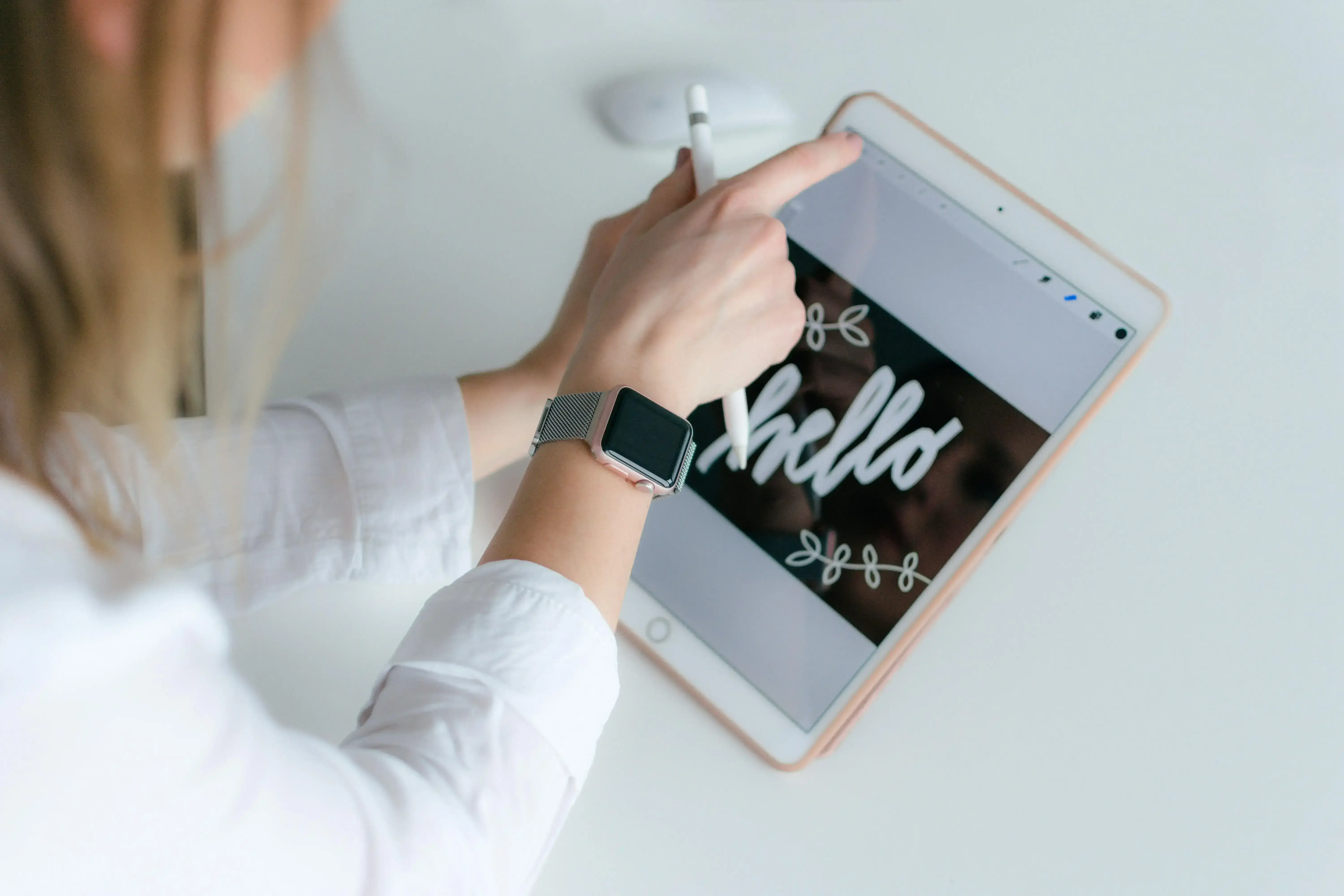
We focus on giving your mobile visitors the same smooth, effortless experience they enjoy on a desktop. With most people browsing on their phones today, it helps to have a mobile-first web design agency that actually understands how real users interact with a website on smaller screens.
As a mobile website design company, we pay attention to the basics that matter, clean layouts, quick loading, easy navigation, and content that adjusts naturally to any device. This is also what drives our work as a mobile first website design company, making sure your site feels comfortable and intuitive the moment someone lands on it.
Our team thinks the way a mobile-first UX company should, every design choice starts with how real people browse on their phones. The idea is simple: help your website show up better, keep visitors interested, and make sure you never lose a potential customer because the mobile experience fell short.

Custom UX & UI Design
Tailored UX and UI design services that prioritize user experience and engagement, ensuring your digital products are both intuitive and visually appealing.

End-To-End Website Development
Comprehensive website development services that cover everything from initial planning and design to deployment and ongoing maintenance, ensuring a seamless online presence.

Seamless User Experience Across All Devices
Deliver a consistent and intuitive user experience across all devices, ensuring that visitors can easily navigate and interact with your site, whether on desktop, tablet, or mobile.


With mobile devices driving half of global web traffic, investing in mobile-first design is essential. Boost engagement and conversions with fast loading times and a consistent, high-quality user experience across all devices.

Slow loading, security issues, and unresponsive design can harm your business. At Digital Silk, we specialize in redesigning brands to address these challenges, ensuring an engaging, responsive, and seamless experience for your visitors.

From strategy to design, mobile-first web design prioritizes key elements and content. We optimize for mobile users with faster loading times, target-specific search intent, and lightweight sites with optimized images and assets to enhance visibility and accommodate data limitations.

Once your mobile-first website is launched, attracting visitors is key. Our marketing experts boost traffic and engagement through services like social media, PPC, and email marketing, ensuring longer browsing sessions and fulfilling your site’s purpose.


The mobile-first approach involves designing for the smallest screens first and then expanding to larger ones. This strategy is highly effective for creating responsive or adaptive designs.
The mobile-first approach emphasizes starting with mobile design, often the most challenging. By prioritizing mobile, designs for larger devices become easier. This method focuses on essential features in the smallest design, creating a strong foundation for the user experience (UX).
The graceful degradation approach starts with a complex design, simplifying it for smaller devices. This can blur core features from supplementary ones and treat mobile design as an afterthought, reducing the experience for smaller screens.
We advocate for progressive enhancement using a mobile-first approach. In this post, we’ll share tips and techniques, followed by a hands-on lesson where we build a hypothetical website using the mobile-first workflow.
This approach also addresses modern user behavior and technological advancements, such as the increasing reliance on mobile devices. By prioritizing mobile design, we can ensure a more effective design process that meets the needs of the majority of users while future-proofing the overall experience.

We’re here to help! Our team is committed to providing clear answers and tailored support, whether you need quick solutions or in-depth assistance.
Connect Our Experts Drop Us a Line
 Ready to take the first step towards unlocking opportunities, realizing goals, and embracing innovation? We're here and eager to connect.


